If, as I understand it, the CBO has a pretty good track record, the chart would be even more impressive if it included the CBO estimates along with the actuals. Not sure which year’s estimates you’d have to use, probably from before the first year of actual numbers.

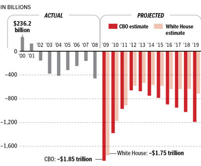
Notice it getting dramatically worse after the ph#$%er leaves office?
…..and the Messiah still hasn’t passed tax-payer…..er, ‘single payer’ health care yet.
If, as I understand it, the CBO has a pretty good track record, the chart would be even more impressive if it included the CBO estimates along with the actuals. Not sure which year’s estimates you’d have to use, probably from before the first year of actual numbers.